Header and footer width
A bug in 2.2.1, submitted by Nils on 18 April 2011
Announcement
Symphony's issue tracker has been moved to Github.
Issues are displayed here for reference only and cannot be created or edited.
Browse
Closed#614: Header and footer width
-

-
- Nils
- Comment #1
- 18 Apr 11, 2:27 am
-

-
- eKoeS
- Comment #2
- 18 May 11, 5:03 am
Unofortunately I have no clues as to why this happens... (Frankly, I don't even consider it as a bug!)
-

-
- brendo
- Comment #3
- 26 May 11, 2:01 pm
Any chance of an ensemble for this @Nils so that we have a real scenario to work with?
-

-
- nickdunn
- Comment #4
- 13 Jun 11, 9:04 pm
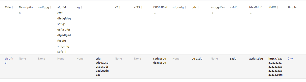
I've just been playing around with this and it seems like it's a browser bug, and not something specifically in Symphony's CSS. It occurs only when the table expands horizontally and forces horizontal scrolling. When it does, the browser treats the viewport width (as if the table was not there) as the actual width, but allows horizontal scrolling so you can still see the rest of the table.
The "fix" is to add overflow: hidden to the table's container, in this case #contents or #wrapper, however this has the effect of hiding the rest of the table if it gets too wide. I recall this used to be the case, and overflow: hidden was removed because tables were being truncated.
With this in mind, I consider this new behaviour to be better than a truncated table.
-
-
- eKoeS
- Comment #5
- 13 Jun 11, 10:17 pm
With this in mind, I consider this new behaviour to be better than a truncated table.
I agree. While being not aesthetically pleasing, this behaviour allows you to look at the whole table and therefore is functional to the user. overflow: hidden should be only used as a last resort and has many drawbacks (like the one Nick explained above).
-
-
- nickdunn
- Comment #6
- 15 Jun 11, 7:06 pm
Woohoo! I think I found a solution.
table-layout: fixed;
word-wrap: break-word;
table-layout: fixed has the effect of forcing the table to assume the width specified by CSS, rather than expanding to the required width of its columns. word-wrap forces any long words in cells (such as URLs that don't contain spaces) to break.
-
-
- nickdunn
- Comment #7
- 15 Jun 11, 7:11 pm
Table headers go a bit crazy when they're long (see the other issue). Can be made a bit neater with vertical-align: bottom.
-
-
- eKoeS
- Comment #8
- 17 Jun 11, 6:21 am
Nice fix! A quick googling has shown that table-layout and word-wrap are widely supported so I vote for Nick's solution. :)
... but I think you and I are posting in the wrong thread :P
-
-
- brendo
- Comment #9
- 17 Jun 11, 7:13 pm
Can you submit a pull request for this nick :D
-
-
- brendo
- Comment #10
- 26 Jun 11, 1:48 pm
This issue is closed.
If a table in the publish area of the backend is extremely wide, header and footer are cut of unexpectedly:
Steps to reproduce:
I'm not sure yet why this happens but I see this behaviour in either Safari or Firefox on Mac OS 10.6.